Stuff you’ll need if you want to try the techniques in this tutorial:
- A smartphone or tablet running the Adobe Shape app
- A copy of Adobe Photoshop CC and/or Illustrator CC
- A Creative Cloud subscription (in order to make use of CC Libraries) . Here’s an FAQ page.
(Sorry to any legacy Adobe application users. This tutorial relies on features only found of the Creative Cloud Libraries.)
Hey kids, there’s a fun new toy in the sandbox!
It’s now possible to go from sketchbook to finished artwork in a few clicks.
Graphic designers have been turning raster images into vectors using Illustrator and the Trace Image feature for a long time but Adobe Shape, albeit a less precise way to accomplish this, gives us a much more spontaneous way to vectorize 2D and 3D stuff in real time, so for those of us who are way into instant gratification, this couldn’t be more up our alley(s). Case in point…I was watching some Swedish murder mystery on Netflix the other night and had my iPad open to Shape and decided to try vectorizing a few scenes that had relatively little movement. This is what I got:
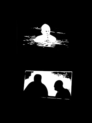
The top image is of a guy swimming in a lake. The other just two guys talking. I spent literally no time on these but as an example of how to capture abstract shapes from literally anything you can photograph. If you can see it, you can path it!
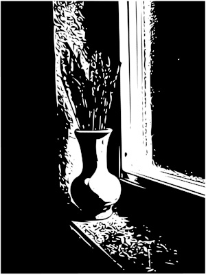
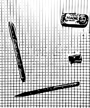
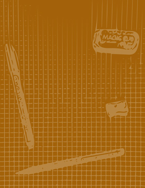
This next image is a Shape rendering of a still life photo that already existed in my Photos library.
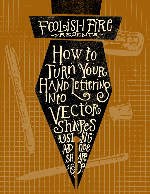
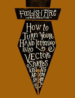
How the title graphic at the top of this post was created using a simple vector shape, plus hand lettering and a background scene photographed with Adobe Shape.
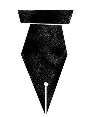
First, I created a pen shape above to contain the title lettering. I started in Illustrator by manually creating a vector shape, then brought that shape into Photoshop, then cut and pasted the layer into Corel Painter. I know all that sounds complicated but I wanted the pen shape to have a textured background and by selecting the black shape in Painter with Auto Select, I could then hide the layer and paint within the selection on a new layer with a pastel brush. I then saved the Painter file as a .psd and opened it back up in Photoshop.
Then some serious fun…
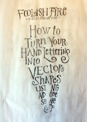
I printed out the pen shape and used it behind a piece of tracing vellum so I knew where to execute my pencil lettering then used a #2 Ticonderoga to draw the letters and didn’t worry too much about the minute details. Once I had it the way I wanted it compositionally, I used my iPad Mini and Adobe Shape to capture the vectorized version of the lettering.
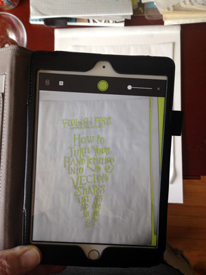
It’s hard to see in the photo but Shape is zeroing in on the dark areas of the design and displaying those areas in green in the iPad display. You can adjust the level of sensitivity to refine the detail and it also allows you to capture a reversed image. Press the camera-style “shutter release” button and it auto-magically creates a vector file which is then saved to a designated Creative Cloud Library.
Creative Cloud Libraries could be the coolest thing Adobe has come up with in years—if you routinely use more than one application for a project (which I do lots of), you can access artwork you’ve saved from various projects, text, color swatches, images, stock photos and just drag and drop them into most CC applications. So to create the title illustration above, I opened a new Illustrator file, dragged my lettering vector artwork onto the art board to do a little vector path clean up, although I could have just as easily dragged the same file into Photoshop (the same CC Libraries appear in almost every Adobe app) and used masks and brushes to get rid of unwanted bits and pieces. It all depends on what kind of edits you want to make.
Starting with the same .psd file I opened up from Painter, I added a color layer for a background and dropped my lettering right on top of the pen layer I created in Illustrator.
I intentionally used a setting in Shape that would pick up a lot of the artifacts created by the wrinkly tracing paper and side lighting, which added some “schmutz” around the letters. I edited out 80% of it but left a little in for character.
The background needed some interest so I used Shape again, set up a “scene” and photographed it in order to create some background interest.
I used this layer right over the background color layer, filled it with color and reduced the opacity to help it recede into the background.
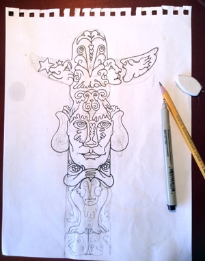
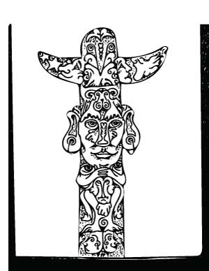
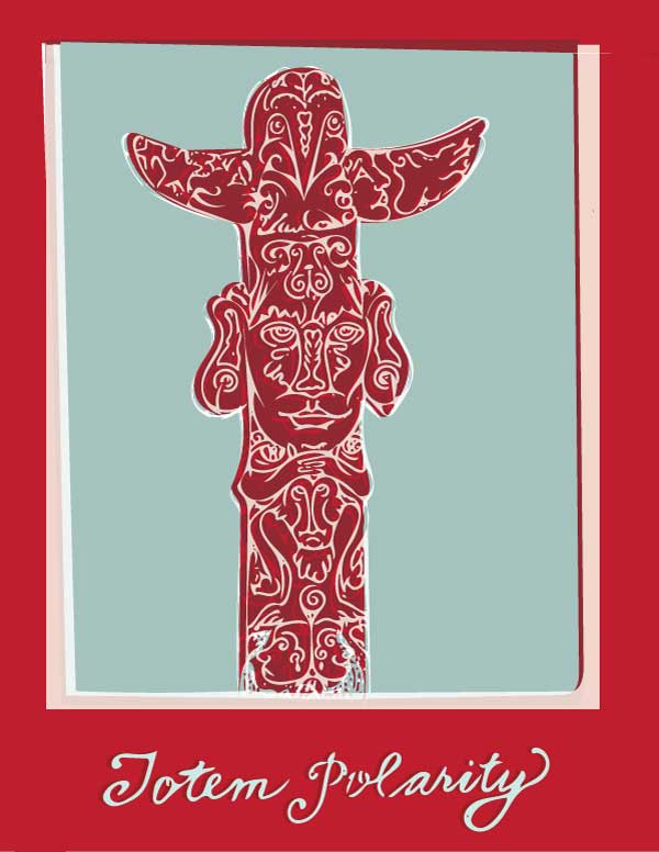
Shape also works on pencil/ink line work illustrations. Left is the pencil sketch nearly all inked in, right is the Adobe Shape vector version.
I played with multiple, layered copies and blending modes in Illustrator to give it a slightly offset color separation look and feel. Here’s one option:
The Takeaway
Some extremely famous and talented calligraphers and letterers use a version of this technique for getting their work from sketch to digital canvas. Since my work is usually much less precise and more sketchy and imprecise, this technique suits my style perfectly, and workflow-wise is much more efficient than scanning and using image trace tools. Photographing 2D line work won’t pick up the fine detail that a 600 dpi scan will, but that’s okay for some projects.
So no, I’m not on the Adobe payroll but I do like to call out a good product when I run across it.
While my first reaction to this tool was definitely “kid in a candy store”, I probably won’t use it for every project. But used in conjunction with CC Libraries, it’s definitely now a permanent resident of my go-to tool box.